
How to Use Color Psychology in Your Website Design
As a website designer, it’s important to consider the impact that color can have on your audience. Color psychology is the study of how different colors can affect our emotions, behaviors, and perceptions. By understanding color psychology, you can use it to your advantage in your website design to create an emotional response in your visitors and improve the overall user experience.
Aligning Colors with Your Brand
One way to use color psychology in your website design is to choose colors that align with your brand and the message you want to convey. For example, blue is often associated with trustworthiness and reliability, making it a good choice for a financial or healthcare website. Green is often associated with nature and growth, making it a good choice for an eco-friendly or wellness brand.
Creating a Specific Mood or Atmosphere
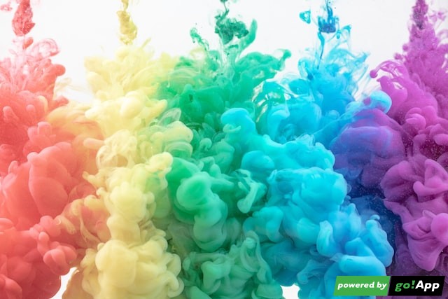
In addition to choosing colors that align with your brand, you can also use color to create a specific mood or atmosphere on your website. For example, using calming colors like blue and green can create a peaceful, relaxed atmosphere, while using vibrant colors like red and orange can create a sense of excitement and energy.
Cultural Connotations of Different Colors
It’s also important to consider the cultural connotations of different colors when designing for a global audience. For example, white is often associated with purity and innocence in Western cultures, but it is the color of death and mourning in many Eastern cultures.
Creating a Cohesive Color Palette
When choosing colors for your website, it’s important to create a color palette that is cohesive and visually appealing. Too many colors can be overwhelming and distract from your content, while a monochromatic palette can be dull and uninspiring. Experiment with different color combinations and ask for feedback from others to find the right balance.
Conclusion
In conclusion, using color psychology in your website design can help create an emotional response in your visitors and improve the overall user experience. By considering your brand, the atmosphere you want to create, and cultural connotations, you can choose colors that effectively communicate your message and enhance the user experience.


 https://unsplash.com/photos/lVF2HLzjopw?utm_source=unsplash&utm_medium=referral&utm_content=creditShareLink
 https://unsplash.com/photos/iIJrUoeRoCQ?utm_source=unsplash&utm_medium=referral&utm_content=creditShareLink

 https://unsplash.com/photos/-WPrNEM_6dg?utm_source=unsplash&utm_medium=referral&utm_content=creditShareLink
